top of page


N
UX APP WIDGETS
CASE STUDY
NEON NEXUS
Designing a Neumorphic Control Language:
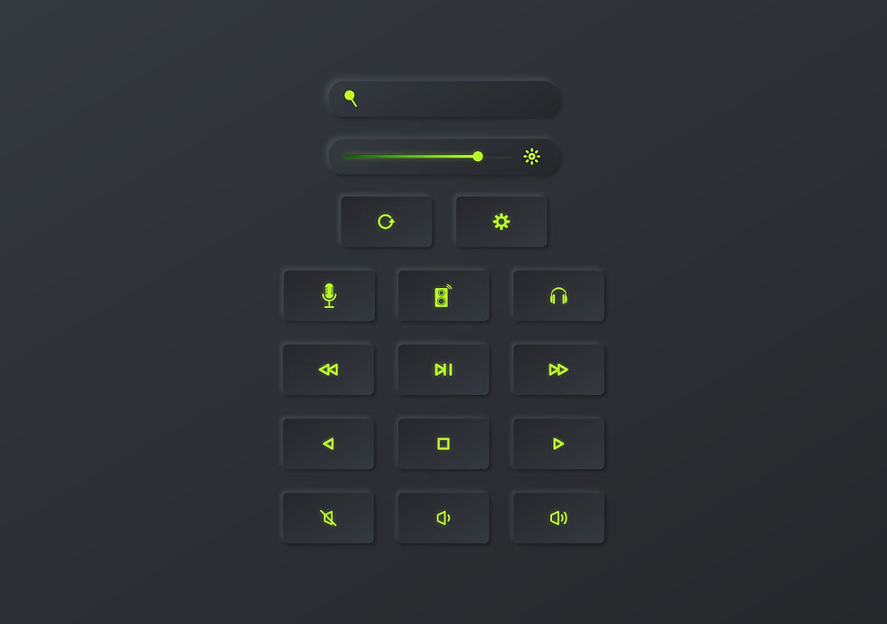
This project began with a single goal: make a TV remote feel as premium and tactile as high‑end audio gear, but on a phone screen. I developed a dark neumorphic design system using charcoal surfaces, soft depth, and neon‑lime highlights to keep the interface both atmospheric and highly legible. The core widgets—sliders, toggles, and icon buttons—established the visual rules for spacing, elevation, and interaction states.


From Cluttered Remote to Focused Widget:
Traditional TV remotes are overloaded with small, identical buttons, so a key challenge was deciding what actually needed to be on the widget. I simplified the experience into focused control zones: navigation pads, volume and brightness sliders, and a concise cluster of transport controls. Each layout variation explores a different hierarchy, testing how quickly users can locate primary actions like power, volume, and play/pause without visual noise.
Streaming‑First Shortcuts:
Because most viewing now happens through streaming apps, the second widget set is dedicated to app‑centric control. I designed a family of streaming buttons and chips—Netflix, Hulu, Disney+, and more—that share consistent shapes, shadows, and neon iconography while still feeling distinct. These shortcuts sit alongside “Continue Watching” and “Recent Apps” tiles, turning the remote from a simple controller into a launcher for the user’s most common viewing flows.

Contextual Control in the Living Room:
To communicate how the widgets live in the real world, I created phone‑in‑hand mockups shown in front of a TV in a dim living‑room setting. The dark environment and TV glow emphasize the neon‑lime highlights on the phone screen and demonstrate legibility at arm’s length. Showing different layouts and TV states across the mockups tells a story of flexibility: the same design language adapts to channel surfing, streaming, and dedicated media‑control modes.
Crafting a Cohesive Micro‑Brand
Across all screens, I treated the widget set as its own micro‑brand: consistent typography, icon weight, and glow levels make every element feel like part of one product, not a collection of isolated experiments. The result is a cohesive UI kit that could plug into an existing smart‑home ecosystem while still standing out visually. This case study highlights how disciplined visual rules can support playful exploration in layout and interaction.


bottom of page